Introducing the Health Dashboard, a Single View of Every Monitor You Run
By Kayla Zhu
Updated August 11, 2026
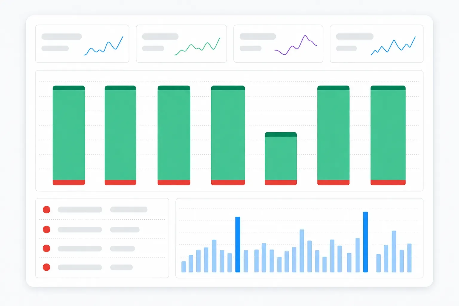
TL;DR: The Health Dashboard gives you the status of every monitor in a workspace in one place. See how many checks ran and what share succeeded, how many alerts went out, how many reports generated, and your estimated monthly check consumption. A daily chart shows successes and failures side by side, a Failing monitors panel lists every monitor that is erroring and why, and a scheduling view shows what's queued for the next 24 hours. Live now at Account > Health, on every plan including Free.
Visualping tells you what changed on a page. That part has always worked well: an alert lands, you see the diff, you act on it.
What was harder to see is how your monitors themselves are doing. If you run twenty monitors, you notice when one goes errors out. If you run two thousand, that's a bit harder. A site starts blocking our crawler, a page 404s, a login expires, and the monitor keeps sitting there looking active while it quietly returns nothing. Finding those meant opening monitors one by one.
The Health Dashboard fixes that. Here's what it does.
See the status of a whole workspace at a glance
Pick a workspace and a time period, and the top of the Health Dashboard gives you four numbers:
- Checks run, with the share that succeeded and the count that failed
- Alerts sent
- Reports generated, split between scheduled and on-demand
- Estimated monthly consumption at your current schedules
Each number carries a sparkline and a comparison against the previous period, so a 4% drop in checks or a 12% drop in alerts shows up as a direction, not just a figure.
Switch between 24 hours, a week, or a month, and set the granularity to 10-minute, hourly, or daily depending on how closely you want to look.
That consumption number is worth watching even when everything is healthy. Checks are frequency multiplied by pages, and it's easy to underestimate what raising a check frequency does to your monthly total.
Spot a bad day at a glance
The Checks per day chart groups every check into three categories: successful checks that sent an alert, successful checks, and failed checks. Green stacks on green, with failures in red along the bottom.
A healthy account looks consistent day to day. A day where far fewer checks ran means something stopped running. A thicker red band means something is failing. A jump in the alert band means something is generating noise you probably want to look at.
You can regroup the chart with the Group by control, or turn on Show 2 periods to lay the current window against the one before it.
Every failing monitor, listed for you
Underneath the chart is where you can view any failing monitors. The Failing monitors panel counts how many monitors are currently erroring and lists them: the URL, what went wrong, and when it last happened.
The reasons are specific. Website Timeout means the page didn't respond in time. Website Error means the request came back broken. Each row has a View link that takes you straight to the monitor, so you troubleshoot the error or pause/delete the monitor.
See what's coming in the next 24 hours
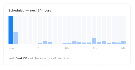
The Health Dashboard also looks forward. The scheduled view charts every check queued for the next 24 hours and calls out your peak hour, along with how many monitors are behind it.
It's useful for two things. If you're close to a plan limit, you can see the load coming before it lands. And if your checks are stacked into one hour of the day, you can spread them out and get more even coverage instead of a burst at 6 AM.
"Users have always been able to see the changes we detect. Now they can see how all of their monitors are performing in one place," said Matthew Fane, Head of Product at Visualping. "If a monitor keeps erroring out or a site starts blocking us, it shows up right away. Troubleshooting used to mean going monitor by monitor, but now it's all visible on one page."
Why this matters if you run a lot of monitors
There are accounts out there with monitors that have been failing for weeks and nobody has noticed. The monitor looks fine in the list, but it's not actually running a check on the website.
Now, with the Health Dashboard, you can see any errors or anomalies with your monitors, instantly, so you can troubleshoot your monitors, delete ones that aren't working, and keep an eye on your check usage.
Getting started
The Health Dashboard is live now. Go to Account > Health in your Visualping account.
There's no setup and nothing to turn on. It reads from the monitors you already have, so the data is there the first time you open it. Use the workspace selector at the top to switch between workspaces.
Everything here works on every plan, including Free.
Frequently asked questions
Do I need to set anything up? No. The Health Dashboard reads from your existing monitors. Open it and the data is already there.
Is it available on the Free plan? Yes. Every plan, including Free.
Where do I find it? Account > Health in your Visualping account.
What time periods can I look at? 24 hours, a week, or a month, with the granularity set to 10-minute, hourly, or daily.
Does it cover all my workspaces? The dashboard shows one workspace at a time. Use the selector at the top to switch.
What counts as a failed check? A check that Visualping couldn't complete. The Failing monitors panel names the reason, most often a website timeout or a website error.
What is estimated monthly consumption? A projection of how many checks your account will use this month at your current monitor count and schedules, so you can see where you'll land against your plan.
Want to monitor web changes that impact your business?
Sign up with Visualping to get alerted of important updates from anywhere online.
Kayla Zhu
Kayla is the Public Relations Specialist at Visualping and manager of Visualping's Journalist Program. She manages Visualping's media relations, content marketing, and social media.
More articles by Kayla Zhu